THE OBJECTIVE
We were tasked with rebranding and rebuilding the FindEmployment platform. This included revitalising their brand to something more current, as well as upgrading the website to something faster and more user-friendly.
SERVICES
- Responsive Web Design
- Job Board Development
- Banner Ad Creation
- Corporate Identity
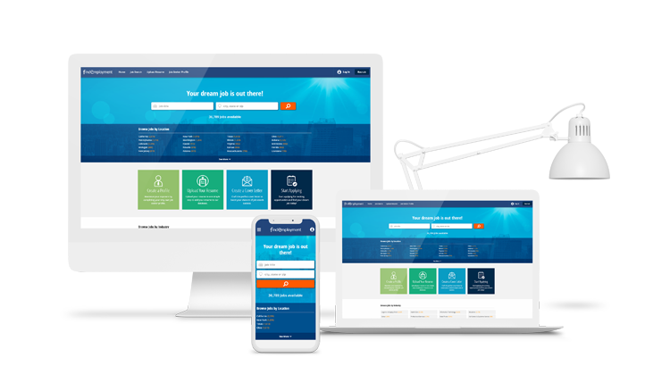
RESPONSIVE WEB DESIGN
The original FindEmployment website was not workable on tablet and mobile devices, as the design was not created with mobile in mind. Using our client-oriented approach, we worked with them to create a fresh and fully responsive modern design to help them reinvigorate their platform. The design also served to brighten and modernise the look and feel of the website, incorporating the colour scheme and elements of brand identity.
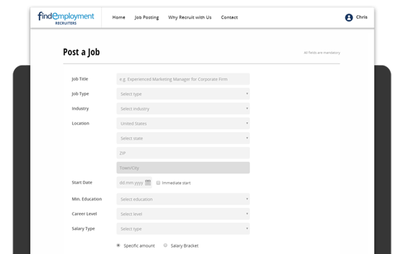
JOB BOARD DEVELOPMENT
On the technical front, the job board was packed with a lot of functionality that was unnecessary and overly complicated for its users. These functions were a massive drain on server resources, so we looked at rebuilding the system in a far more simplified way – with the user in mind. We managed to increase the system speed and optimise the functionality so that the platform worked for all users.
BANNER ADS
We were also tasked with creating numerous sets of banners for FindEmployment, including campaigns for the launch of the upgraded job board, product offers, and the promotion of recruitment and job seeking functions. The banners were designed to grab attention while representing the colour scheme and brand identity effectively. They also had to be web-friendly and made in all major sizes for the use of social media marketing and on their website.

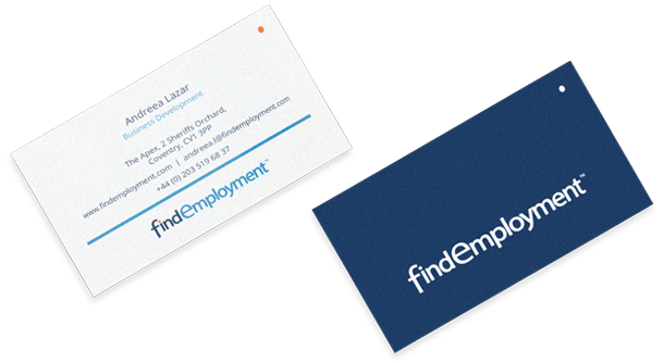
CORPORATE IDENTITY
Our design team used the different blues of the FindEmployment logo in a way that would accentuate their stationery and corporate documents. The clean yet noticeable style matched nicely with the digital look we created for the job board. The original logo for FindEmployment was also looking a bit dated. Our task was to breathe new life into the logo, using the existing colour scheme but adding a fresh look to it.