Helping forex traders to discover their trading style.
THE OBJECTIVE
The goal for Traders Test was to build a platform that was focused around a specific marketing funnel - to direct potential forex traders to the brokers. The test itself had to determine whether the taker had the necessary personality and intellect to be able to trade forex online.
SERVICES
- Logo Design
- Test Creation
- Corporate Identity
- Design
- Web System Development
LOGO REDESIGN
When tasked with creating the logo for Traders Test, the design team wanted something that would be easy to recognize but still produce something that made it unique to the project. By displaying the whole name, with the “A” modified into a double up arrow (representing growth and profit), the team created something that was memorable and unique. The logo was also optimised with social-friendly variations and sizes.

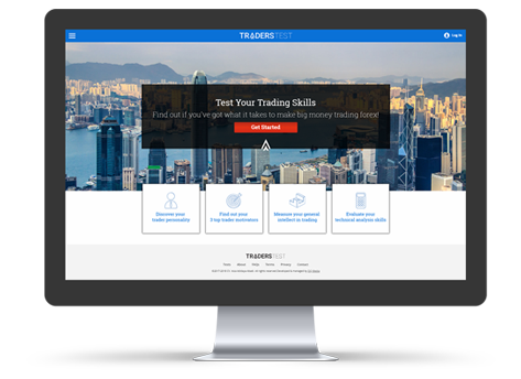
WEB DEVELOPMENT
The plan was to deliver a website that was both visually appealing and clean of distractions. Using a mobile-first approach and adding engaging images and icons, we created a design that was clean yet visually stunning. The website was optimised for all devices and speed, giving users the best possible experience regardless of the device used to visit the site. The functional development involved the generation of test results and mapping to a matrix of possible outcomes.
SCIENCE & TECHNOLOGY
Using our experience with the Career Hunter testing platform, we conceptualised and formed the science behind the tests that would allow us to determine the user’s personality, discover their motivations and assess their numerical and abstract reasoning skills. This set of modified psychometric tests gave us the results to be able to pinpoint specific trader types while recommending a relevant trading account.

CORPORATE IDENTITY
The corporate identity for Traders Test was shaped using some of the same design elements that were used for the website - all in order to keep design consistency. The eye-catching double up arrow symbol was heavily embedded into the designs, giving a really unique and memorable impression. We also focused on keeping the colouring and stylisation of their documents and stationery in line with their brand identity.